
Brightstar — Rebrand
Brand strategy, brand expression, creative direction, design
After 10 years of proving that specialist finance doesn’t need to be complicated when in the right hands, Brightstar had firmly established its position as the UK’s number one specialist distributor.
But as any business scales up, it starts to finds its personality and communications no longer match up with its vision. Brotherland were enlisted to help determine a new brand and voice. We ran a series of internal workshops, coupled with interviews with figures from across the industry, alongside various other secondary research methods, to find out how Brightstar could fit cohesively within the sector. This kind of collaboration enabled both us and Brightstar see a greater picture, and determine how it could speak to its audience of brokers at eye-level, whilst also opening up dialogue with newer audiences in the future.
But as any business scales up, it starts to finds its personality and communications no longer match up with its vision. Brotherland were enlisted to help determine a new brand and voice. We ran a series of internal workshops, coupled with interviews with figures from across the industry, alongside various other secondary research methods, to find out how Brightstar could fit cohesively within the sector. This kind of collaboration enabled both us and Brightstar see a greater picture, and determine how it could speak to its audience of brokers at eye-level, whilst also opening up dialogue with newer audiences in the future.

We found out that Brightstar customers liked they were dealing with people - they built relationships, and were there for them. In contrast with cold, heavily tech-centric brands in the space, we set about creating a more human tone.
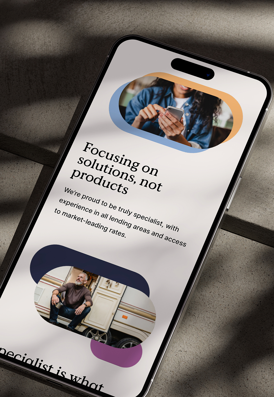
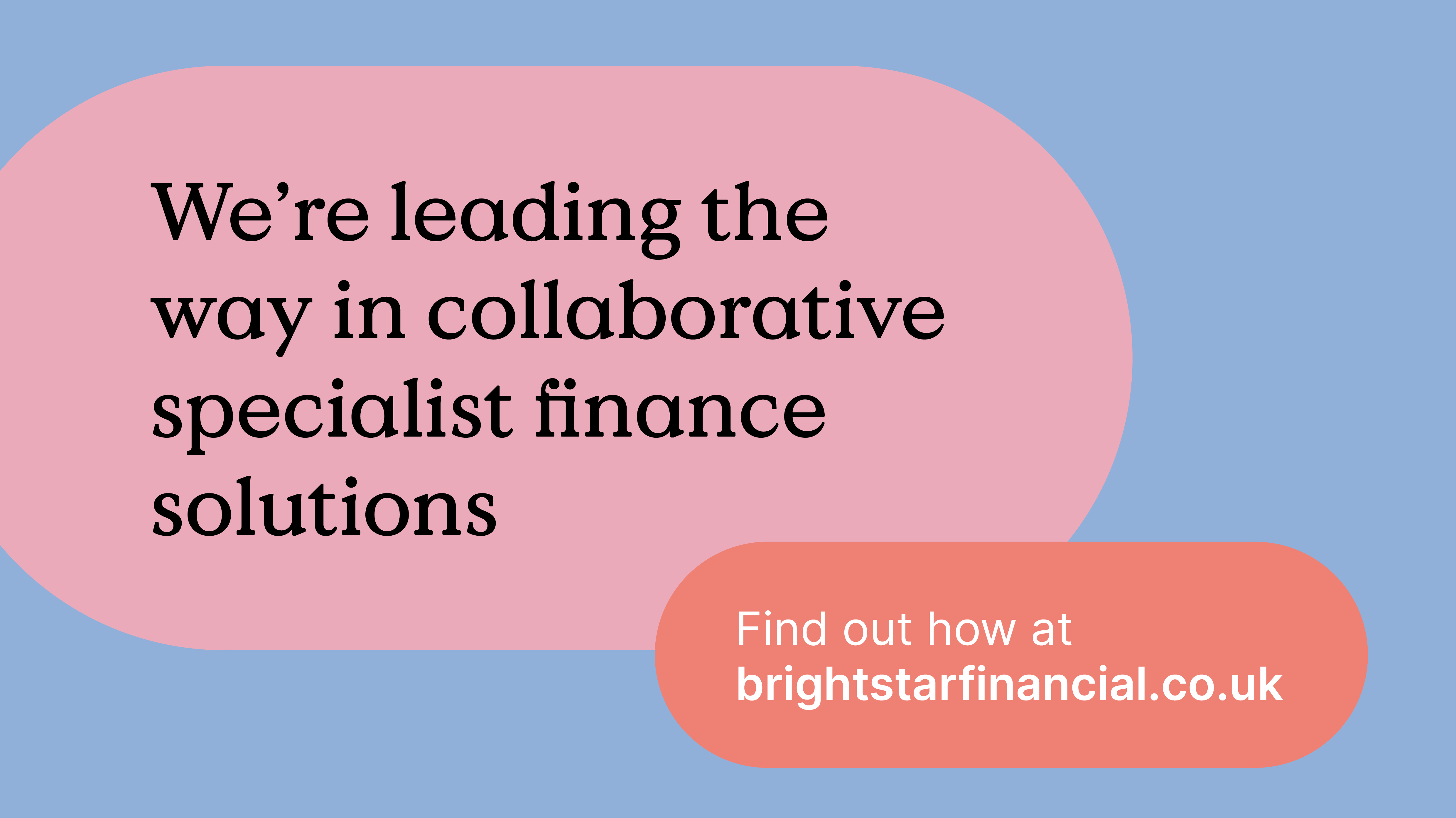
Long, rounded shapes inspired by travelling starbeams suggest the free flowing nature of business; these formed the logo and the graphic backbone of the visual identity. A soft, humanistic typeface was chosen, that was still reminiscent of traditional financial institutions, inspiring confidence and reassurance in the brand.
Long, rounded shapes inspired by travelling starbeams suggest the free flowing nature of business; these formed the logo and the graphic backbone of the visual identity. A soft, humanistic typeface was chosen, that was still reminiscent of traditional financial institutions, inspiring confidence and reassurance in the brand.

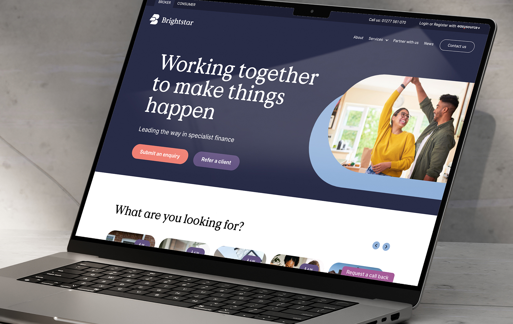
The brand puts people at the heart of it - photography, featuring relatable subjects rather than the usual houses and property found in the lending industry; a tone of voice that speaks to its audiences at eye-level, whilst always remaining reassuringly knowledgeable and professional.
This all culminated in a comprehensive set of brand guidelines, a suite of new brand assets, and a fresh, well-constructed website. Campaigns have begun to roll-out already, and the brand allows Brightstar to continue to lead the way.
This all culminated in a comprehensive set of brand guidelines, a suite of new brand assets, and a fresh, well-constructed website. Campaigns have begun to roll-out already, and the brand allows Brightstar to continue to lead the way.