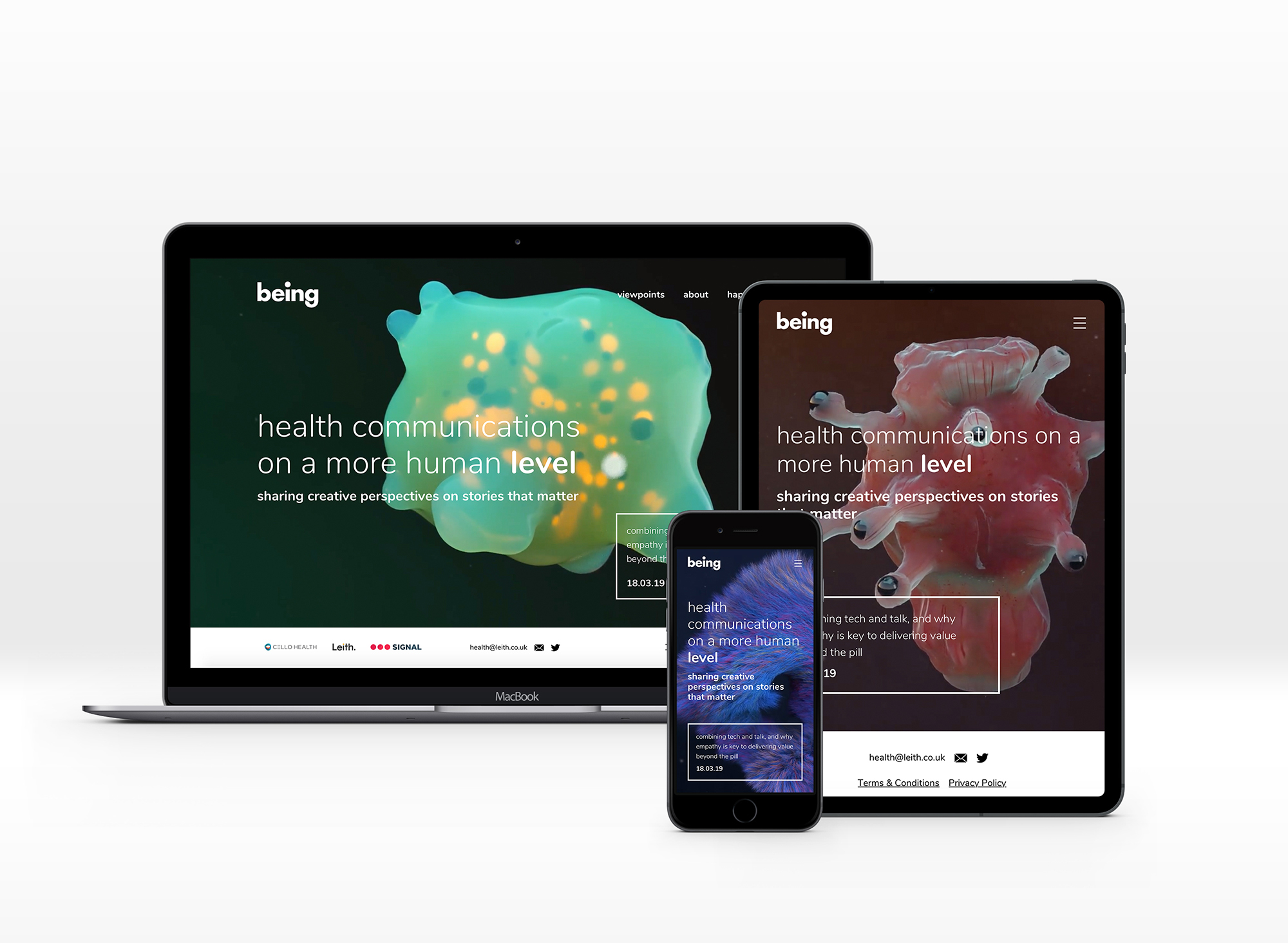
Being — Brand Identity
Naming, concept, design
Tasked with creating an identity for a specialist healthcare communications consultancy, part of creative agency Leith. Bringing together creative thinking and scientific knowledge, it needed to be unique, and different to the formulaic approach most healthcare agencies take with their branding - DNA strands, men in white coats and unidentifiable chemicals.
After personally considering countless options for a name, Being was born - a word that can have an array of different meanings depending on the context, whether as a noun for a living creature, or as a verb to describe mood or state.
After personally considering countless options for a name, Being was born - a word that can have an array of different meanings depending on the context, whether as a noun for a living creature, or as a verb to describe mood or state.
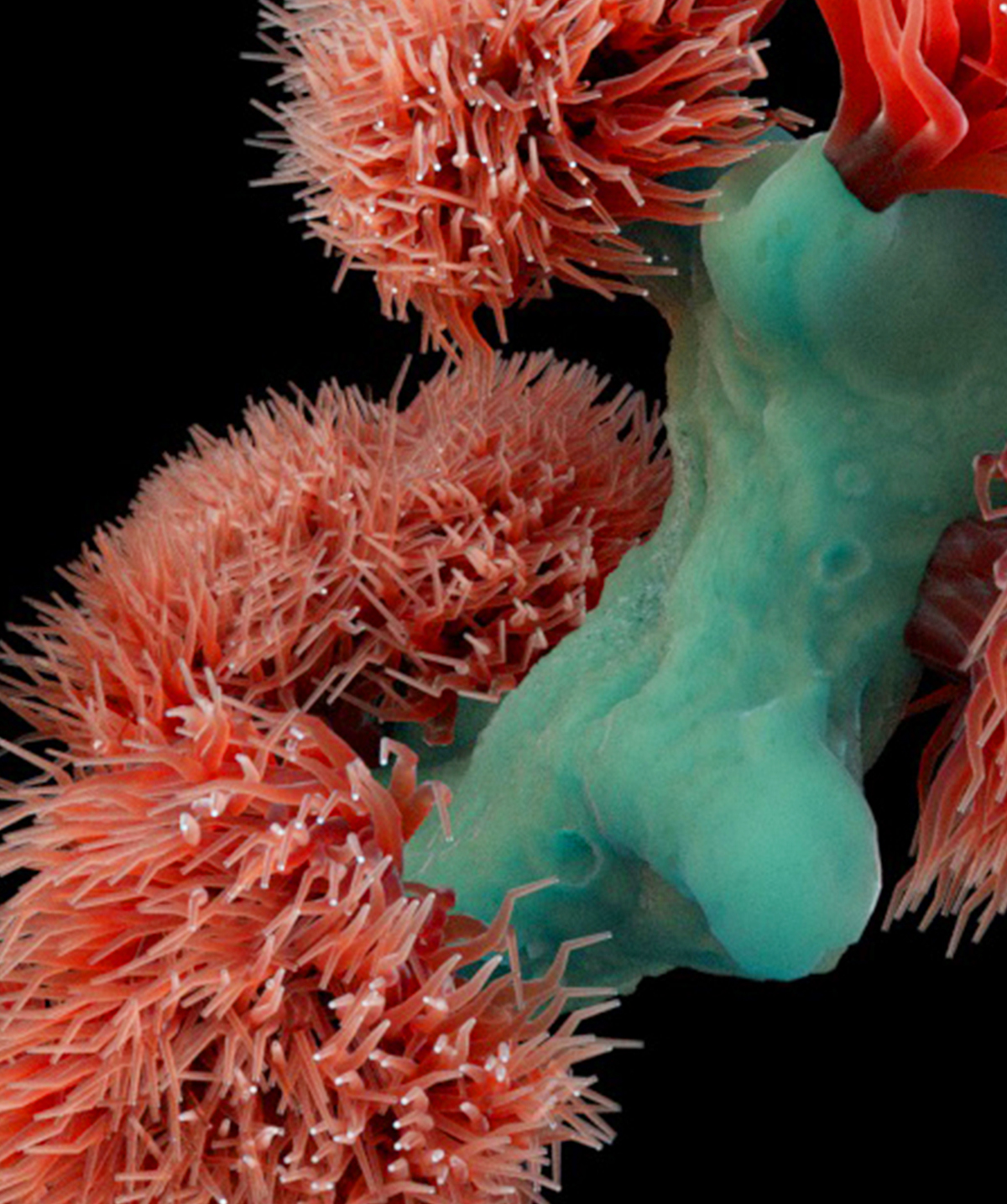
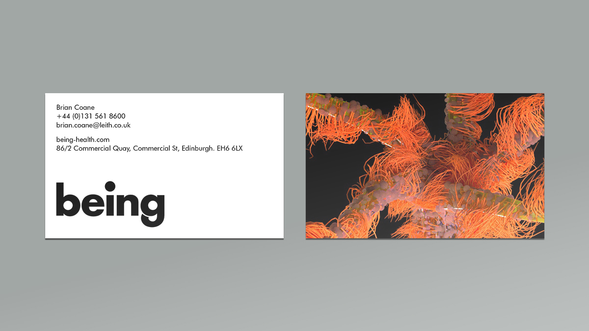
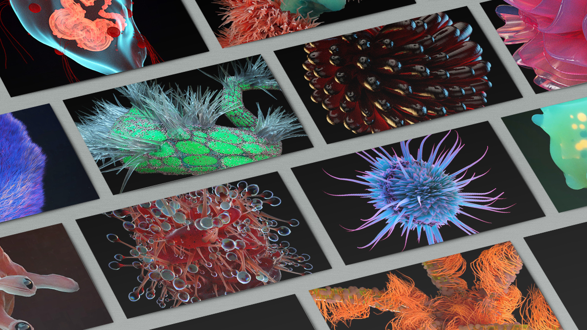
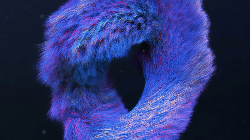
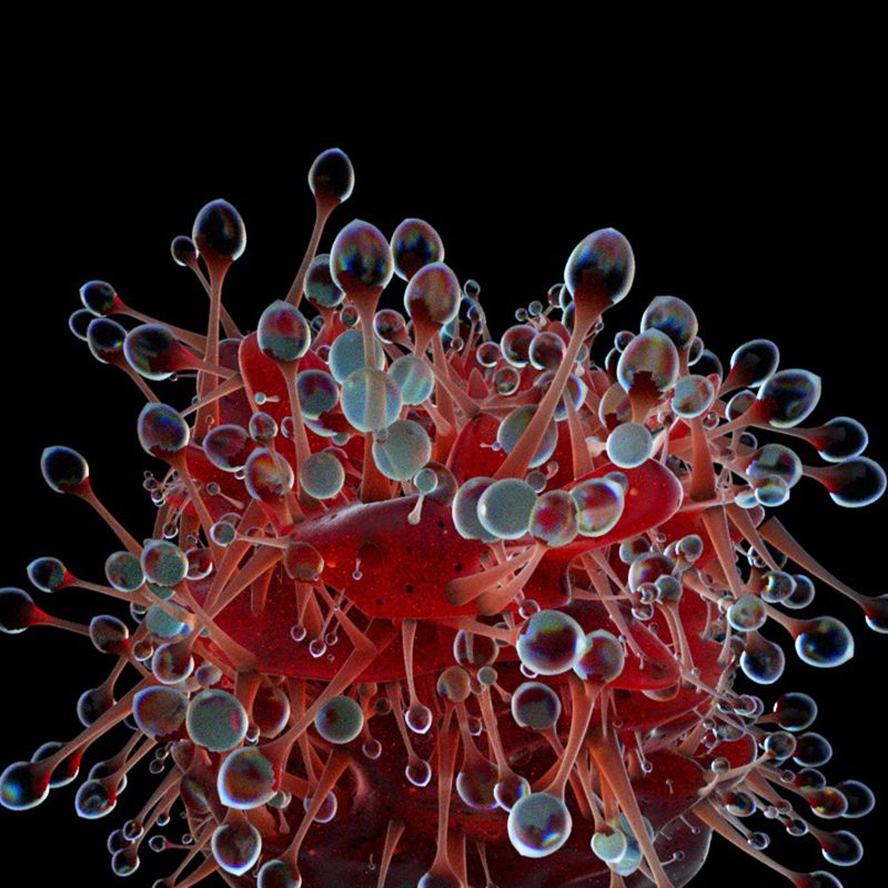
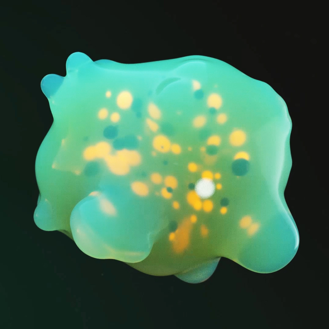
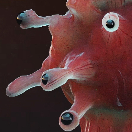
The visual identity is based around strange, otherworldly ‘beings’. These critters were built in CGI, and incorporate various elements and textures from real world creatures, to create alien, but familiar forms. They position the brand as one who does things differently, and can think in ways its competitors can’t.
The word mark needed to capture this organic and exciting personality, but also could be used in a professional context, particularly when talking to often more straight-laced clients, such as pharmaceutical companies. Simple, geometric type forms the basis of the logo, but with some small flourishes to bring the character of the brand to it - an oversized dot above the i, or the descender of the g that begins to curl up behind itself, as if it were a tail.