Courier — Digital World Alignment
Brand expression, brand design, digital design
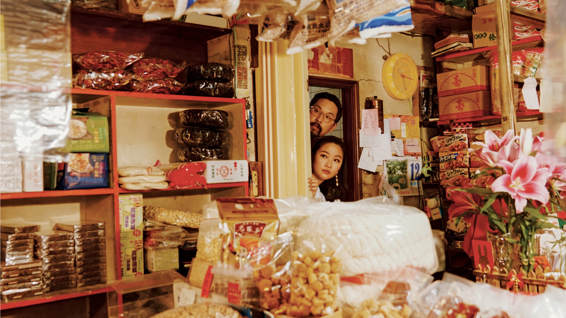
Courier Magazine delves into contemporary business and startup culture worldwide, investigating how individuals shape their work and lifestyles on their own terms. Celebrating its milestone 50th issue, the magazine underwent a sweeping redesign, marking the most significant transformation in its decade-long history. Departing from conventional layouts, the publication elevated its photography and adopted a distinctive approach to features and design, infused with surprises and allure. However, its digital platforms remained rooted in its old brand world and design language.
THE BRIEF
Working with creative director Lisa Rahman, we set about finding ways in which we could bring digital content into this new expression, whilst still feeling native to the platforms it existed on.
THE BRIEF
Working with creative director Lisa Rahman, we set about finding ways in which we could bring digital content into this new expression, whilst still feeling native to the platforms it existed on.


THOUGHTFUL EXPRESSION
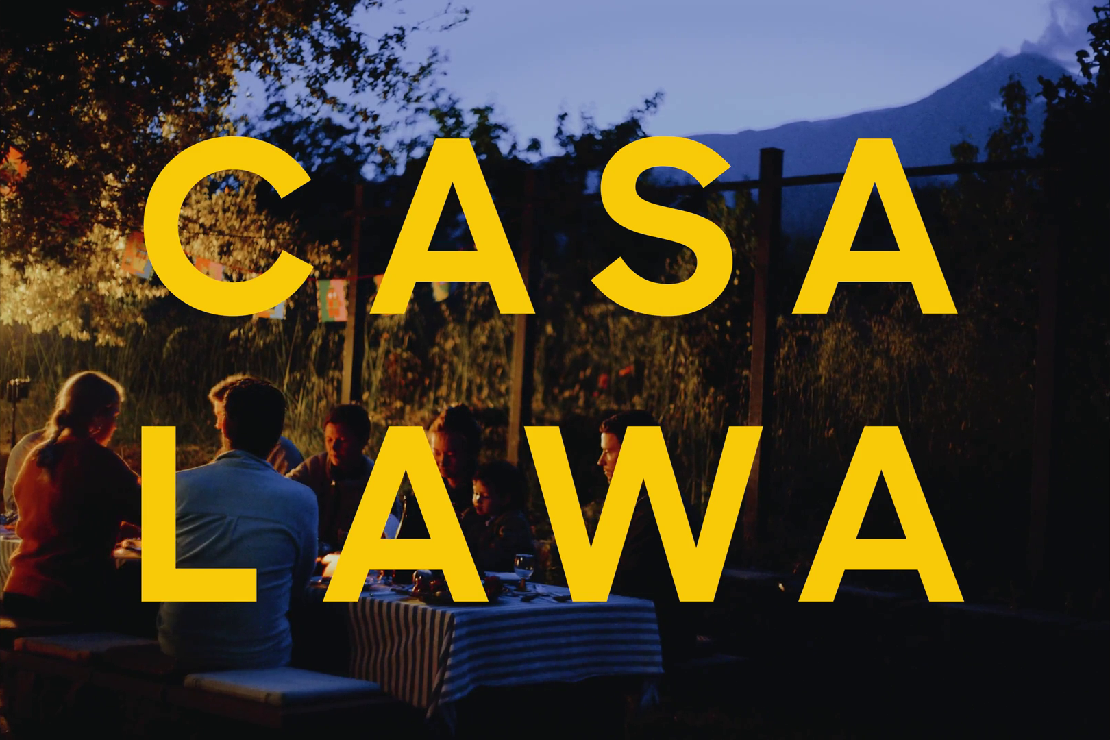
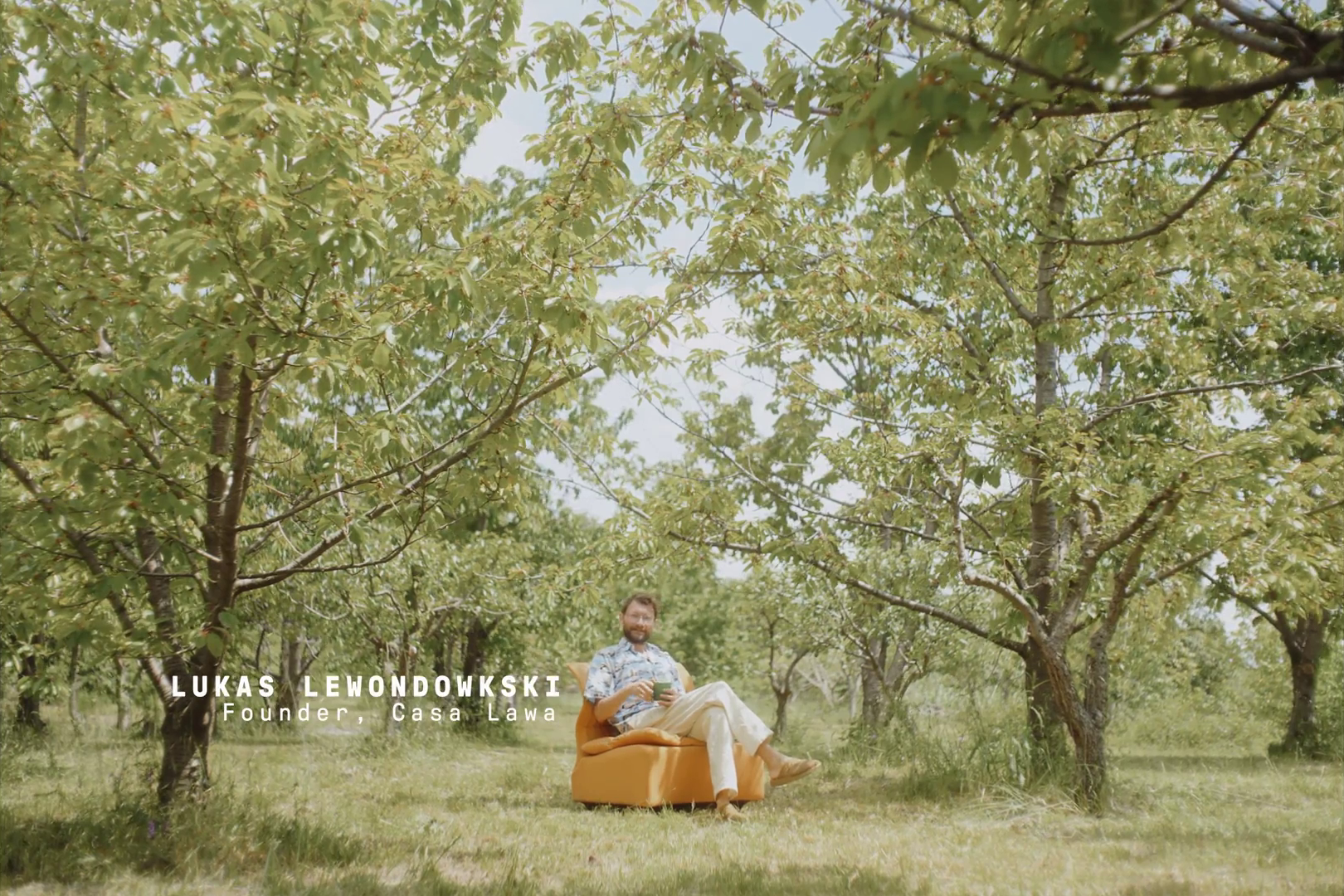
We sought to achieve ways of communicating across social platforms that wouldn’t simply be transferring what works in print to digital spaces. Particularly on TikTok, it had to feel relevant and authentic to where it was appearing - users of the platform can feel uncomfortable when content looks inorganic. For long form content, we could develop more of a style that complements the playful, intriguing style of the work.
We sought to achieve ways of communicating across social platforms that wouldn’t simply be transferring what works in print to digital spaces. Particularly on TikTok, it had to feel relevant and authentic to where it was appearing - users of the platform can feel uncomfortable when content looks inorganic. For long form content, we could develop more of a style that complements the playful, intriguing style of the work.
A digital expression that feels true to Courier


SURPRISE & INTRIGUE
We met the audience where they are, on their own terms. A design language that adds to content, not distract from; ways of communicating that are meaningful, not just for the sake of talking; a look that references the print piece, not imitates.
We met the audience where they are, on their own terms. A design language that adds to content, not distract from; ways of communicating that are meaningful, not just for the sake of talking; a look that references the print piece, not imitates.
Story telling that speaks to audiences at eye-level
MAKING IT USABLE
These new design systems needed to be practical for video editors, marketeers and content markers to implement, with good, clear guidance. We distilled all of our direction into practical guidelines for content creators - a particularly tricky task when using the native design tools of social platforms. After much experimentation and testing, around editing, types of shots, and graphics, we devised guidelines that could be implemented through YouTube, email and Tiktok content, that would create solid, consistent approaches for editors and designers to follow, and create work that felt native to the respective platforms.
These new design systems needed to be practical for video editors, marketeers and content markers to implement, with good, clear guidance. We distilled all of our direction into practical guidelines for content creators - a particularly tricky task when using the native design tools of social platforms. After much experimentation and testing, around editing, types of shots, and graphics, we devised guidelines that could be implemented through YouTube, email and Tiktok content, that would create solid, consistent approaches for editors and designers to follow, and create work that felt native to the respective platforms.