
Easysource+ — Rebrand
Brand strategy, brand expression, creative direction, design, UI & UX design
The relaunch of easysource+, previously easysource, highlights a growing shift in the mortgage industry as specialist finance continues to grow for a number of reasons, including freelance culture and the funding of projects such as extensions for home offices.
The platform helps brokers navigate complex specialist lending with ease, allowing them to explore multiple solutions for their clients.
To prepare for their new offering, we created a whole new brand and tone to set them up for their next step, positioning it as a standalone piece of software away from the main Brightstar brand.


We moved the platform beyond being merely functional and transactional, establishing longer lasting relationships with their customers and in turn shift category perceptions from uninspiring and functional to warm and compelling.
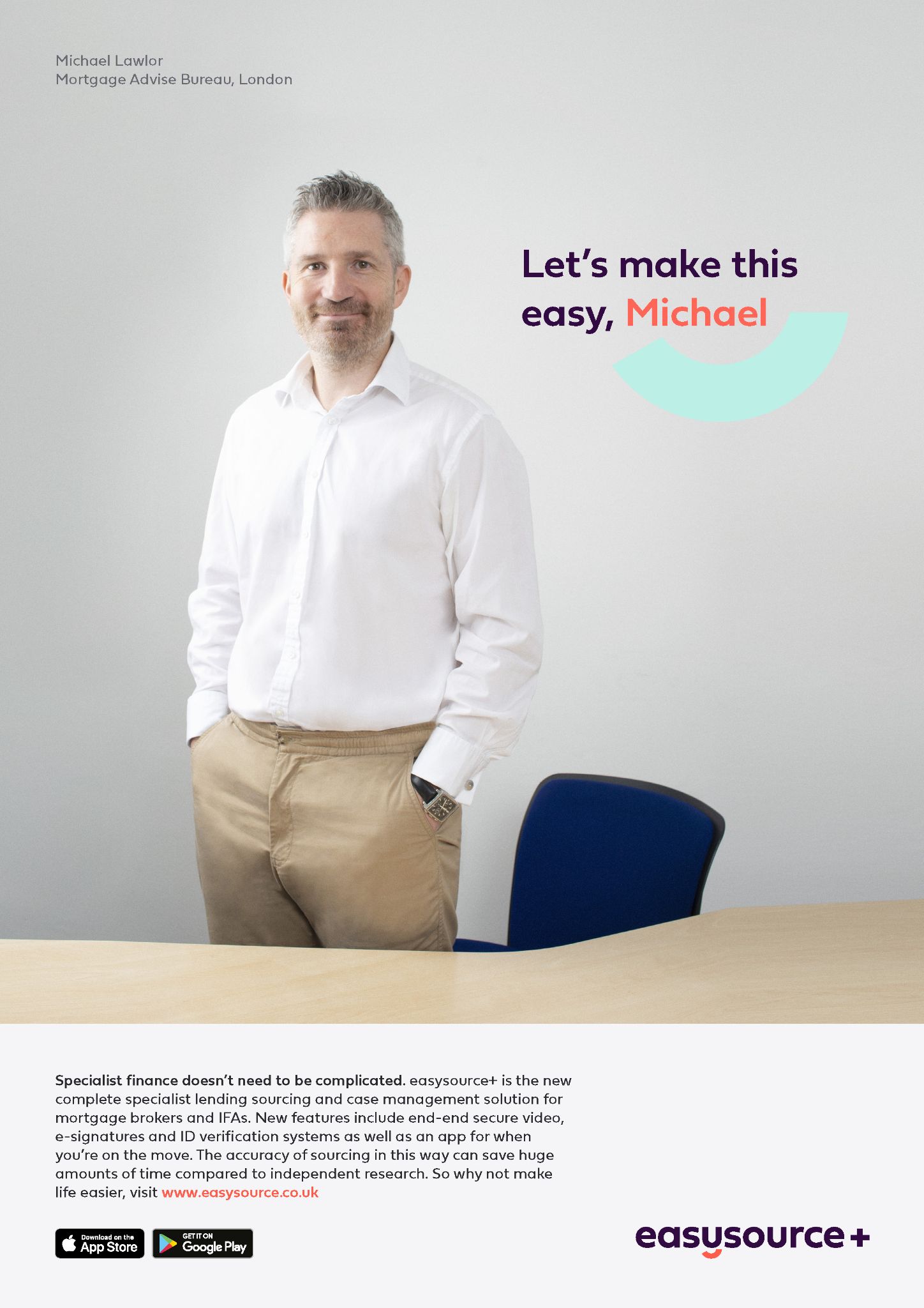
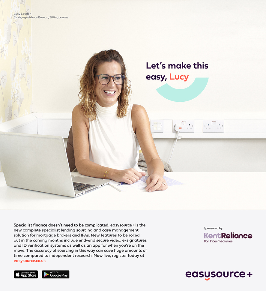
Complete guidelines were also developed, not only outlining the technical points of graphic design and typography, but also detailing the tonality and attitude that the brand and its representatives should adopt. Moving the brand from the relatively dull, seemingly over-complicated world of specialist finance into one with a BROKER FIRST attitude, we help them speak to customers at eye-level, creating an atmosphere of reliability and affinity.
Complete guidelines were also developed, not only outlining the technical points of graphic design and typography, but also detailing the tonality and attitude that the brand and its representatives should adopt. Moving the brand from the relatively dull, seemingly over-complicated world of specialist finance into one with a BROKER FIRST attitude, we help them speak to customers at eye-level, creating an atmosphere of reliability and affinity.


A HUMAN FACING BRAND
The brand puts people at the heart of it - photography, featuring relatable subjects rather than the usual houses and property found in the lending industry; a tone of voice that speaks to its audiences at eye-level, whilst always remaining reassuringly knowledgeable and professional.
This all culminated in a comprehensive set of brand guidelines, a suite of new brand assets, and a fresh, well-constructed website. Campaigns have begun to roll-out already, and the brand allows Brightstar to continue to lead the way.

REDESIGNING THE PLATFORM
We completely overhauled the platform itself, redesigning the UX of it so that it feels easy to use and accomodates the many different needs of its users. Three distinct portals for the three different groups of users were designed for, using different aspects of the colour palette to make distinguishing between them easy for the few users who may need to engage across them all. before developing a full UI for the platform, ensuring a fully joined up, consistent tone throughout.
We completely overhauled the platform itself, redesigning the UX of it so that it feels easy to use and accomodates the many different needs of its users. Three distinct portals for the three different groups of users were designed for, using different aspects of the colour palette to make distinguishing between them easy for the few users who may need to engage across them all. before developing a full UI for the platform, ensuring a fully joined up, consistent tone throughout.


